
The 7 types of logo designs
- Chris James

- Jan 15
- 5 min read
When it comes to creating a memorable brand, your logo is the cornerstone of your visual identity. It's the first thing people notice and the symbol that often stays in their minds long after they've encountered your business.
But one thing that the average consumer - and even some entry level designers - don’t know, is that there are different categories of logo design - 7 of them to be exact!
That information can sometimes be overwhelming for clients as well as designers, so I’m going to break down the 7 primary types of logo design, and offer insights for how each type of logo can reflect the personality, values and message of your brand.
Whether you're designing a logo for your business or just curious about the art of branding, understanding these types will help you make an informed decision and create a logo that truly resonates.

Mascot Logos
Mascot logos are typically used for creating a friendly, approachable, and memorable brand identity.
By using a character or figure to represent their brand, mascot logos inject personality and emotion, helping to humanize the brand and build a deeper connection with customers. They’re especially effective for brands that want to appeal to families, children, or a broad audience, as mascots can embody fun, energy, and relatability.
Mascot logos also work well for brands looking to differentiate themselves in competitive markets by offering a distinct, fun, and instantly recognizable visual identity that stands out in the minds of consumers.
Mascot logos are effective for brands in industries like sports, food, and entertainment, because they help to create a sense of excitement, community, and loyalty. For example, sports teams use mascots to represent their team spirit and energize fans, while fast-food chains like McDonald's (with Ronald McDonald) use mascots to establish a playful, kid-friendly image.

Pictorial Logos
Pictorial Logos are simply a symbol used to represent their brand, where the logomark is often a literal representation of the brand's name, or the services offered.
Some examples of this include Apple, Target and Domino’s Pizza - where their corresponding logos are an apple, a target, and a domino.
Other pictorial logos are quite literal and tend to represent something about the brand, like how Snapchat’s logo is a ghost to represent how your photos disappear after you click away from them, or how the World Wildlife Fund uses a Panda to represent the work they do to help endangered animals.
I used a pictorial logo to design the logo for The Succulent Spot - I designed a minimalist design of a succulent plant to be the literal representation of this business.
Pictorial logos are unique because there are no limits to what you can use as your imagery for your logo, so any brand can benefit from a pictorial logo.

Abstract Logos
Abstract logos are versatile, creative, and modern, often used by brands looking to create a unique and conceptual identity that isn’t bound by literal representation. Instead of relying on recognizable objects or symbols, abstract logos use geometric shapes, forms, and colors to evoke a feeling, concept, or idea. While similar to a pictorial logo in the sense that they use a symbol to represent their brand, pictorial logos are a clear representation, while abstract logos
Abstract Logos also often convey a hidden message within the logomark, something that the general public might not pick up on, but someone who is associated with that product or field will likely recognize it. For example: This logo I designed for Evans Piano Academy might just look like a letter E with some slits in it to most people, but individuals who play piano will be able to realize that it’s actually piano keys turned on their side to look like the letter E.
These types of logos are popular as they condense your branding into a single icon, while avoiding using something recognizable. Abstract logos tend to become the most iconic and recognizable logos
While abstract logos are versatile and can really be used by any brand, they tend to be used by technology brands, entertainment and media brands, and creative agencies.

Emblem Logos
Emblem Logos, more commonly referred to as Badge Logos in this day in age, are actually the oldest style of logo! Originally designed to represent a crest or a seal, these logos were typically designed to be an “all or nothing” type of design. Most emblem logos contain the brand logo, or a variation of it, along with an icon, imagery, a pattern, and sometimes even the brand tagline.
While this style of logo is typically looked at as out-dated and old-school, many brands still prefer emblem logos for their branding, with an updated/modern twist on them of course!
Brands that tend to use emblem logos include Heritage brands, Luxury brands (especially luxury vehicle brands), Sports Teams, Universities and Healthcare Centres.
Emblem Logos work for these types of brands because the shape of an emblem logo can help to establish authority as a leader in their field. Emblem logos also often feature detailed, recognizable symbols, making them great for creating a strong and memorable brand identity.
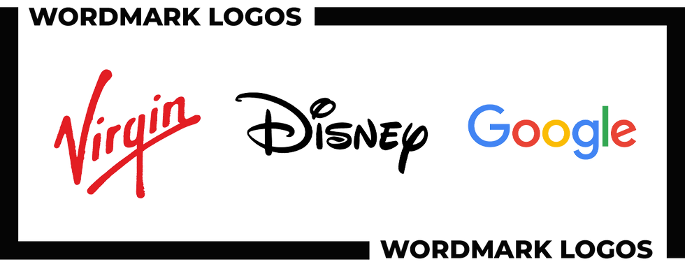
Wordmark Logos
Wordmark Logos are exactly what you would expect them to be, they’re logos that focus on the business name with a distinctive typographic style. Unlike logos that incorporate symbols or images, wordmarks focus solely on the name of the business, using custom fonts, colors, and letter spacing to convey the brand’s personality and values.
Wordmark logos, also known as “logotypes”, work well for brands with widely recognizable names who want to emphasize on brand recognition through their name alone. By focusing on typography, wordmark logos allow for clean, modern, and highly versatile branding that scales well across different mediums, from websites to merchandise.
I used a wordmark logo when I created the brand identity for “The Simply Miles Podcast”.
Businesses that tend to use wordmark logos are brands in the fashion, technology and entertainment industry, where their name itself holds strong brand equity.
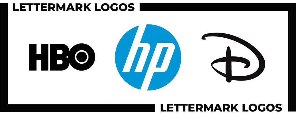
Lettermark Logos
Similar to wordmark logos, Lettermark logos are a type of logo that uses the initials or abbreviation of a brand's name rather than the full name itself. These logos simplify the brand identity by distilling it down to just a few key letters, often stylized in a unique, memorable way. Both wordmark and lettermark logos rely heavily on typography, but lettermarks are better suited for companies with longer names, while wordmarks work well for brands with shorter, more straightforward names that can stand alone.
Some brands even have both a wordmark and a lettermark logo, if their brand is recognizable enough. Disney is one example of this, where the font in their wordmark is so iconic, that they can just use the letter D in the same font and it’s recognizable as Disney.
I used a lettermark logo when I designed the branding for Midtown Mountain, by using two M’s in a creative way.
Lettermarks are particularly useful for businesses with long or complex names, as they create a more concise, recognizable mark that’s easier to remember and reproduce, examples of this can include CNN, IBM and HP.
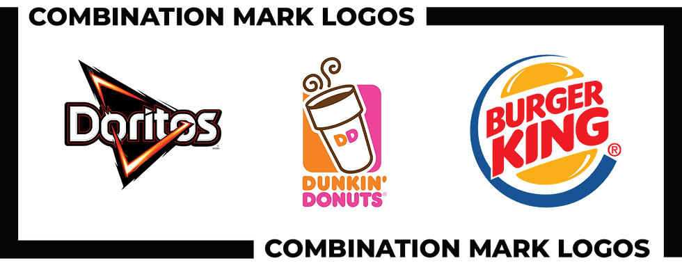
Combination Mark Logos
Finally, Combination Mark Logos are exactly what they sound like, a combination of two or more of the first six logo types we talked about.
An example of how this can be done is by combining a pictorial logo design, with a custom wordmark or lettermark so that the brand has two iconic elements. The original Dunkin’ Donuts logo is a great example of this because they had their coffee cup pictorial logo, alongside custom typography for their name. Both of these elements are recognizable on their own, and can be combined into one logo, creating a combination logo.
Now you might be wondering, wouldn’t all pictorial logos be combination marks because they have the brands name alongside the mark? This is true, however, where a combination mark logo differs from a pictorial logo with the brand's name, is if the text is designed thoughtfully as opposed to just simple typography. Again using Dunkin’ Donuts as an example, the way the two words are the two different colours, this is the unique factor that makes it a combination mark logo.

Comments